
Designing and analysing my own digipak
- 21 feb 2019
- 4 Min. de lectura
Actualizado: 5 mar 2019
Front cover:
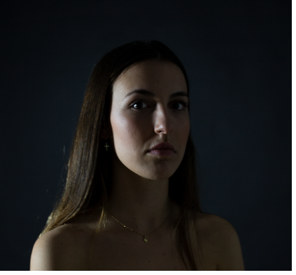
To design the front cover of my digipak, I first did some research about pop, reggae and rock digipaks, I analysed a pop digipak in depth as the genre I chose was pop-ballad. A common feature of these digipaks is that the images used in pop albums tend to stand out from the rest of the frame, the artist is normally the main focus of the front cover and uses a certain pose to achieve this. Because of this, I decided to take the girl I chose some photos in a black background in order to make her the main focus of the front cover. The camera shots are normally close ups of the artists face to make it stand out and to catch the audiences attention.
The colours are rather dark because the song I chose talks about problems with alcohol and deep subjects which is the reason why I decided to use black as the main colour.
I used Photoshop to put in the letters and Light-room to edit the lights, the saturation and the shadows. By this I lightened her face up a bit more and made the background darker. The lighting in pop digitalis tends to be high key, this means it illuminates the artists face. This is why I used Light-room to lighten her face.


A thing I wanted to stand out was the fact that in the front and back cover (which are the covers that everyone sees) she is wearing clothes while inside the digipak she is naked. The message I want to get through by this is the fact that outside she seems okay and strong (as the lyrics of the song tell) and in the inside she is naked and vulnerable.
The titles and fonts used in in pop CD's tend to be large and bold and that is exactly what I did in order for them to stand out. Nevertheless, I put her name at the back of her head so people would still have her as the main focus but still used big bold letters so they stand out too. The font overlaps the main image which means that the audience looking at this CD will read the title after anything else which leads to people actually knowing the name of the album. The text goes below , normally in bold letters, in order to be the second thing that catches the audience's attention.
Back cover:
These are used to display the name of the songs, usually with the number of the songs in order to indicate the people buying this which is the order of the songs. Back covers are used to place additional information such as bar codes, production company name or credits. Back covers are not as attractive as the front covers.
I chose to use a photo of the same photo-shoot in order to match the front cover.


I just picked a photo of her profile so it would work out in a way that she is looking at the lyrics. The songs titles were random songs I chose plus the one in my music video and the name of the album which I also invented. Normally, there is a song which has the same name as the album so that is what I did. In the back cover I also used Photoshop to add the lyrics and the text at the bottom which every album has and talks about copyright rights. I picked a random bar code from the internet and added it at the bottom left hand corner as most albums do. Light-room was also used in order to lighten her face up and make the background darker.
CD design:

I wanted to make a simple CD design because after seeing many examples of CD's, I saw that none of them were very complex. Following my black theme, I decided to have black as the colour of the Cd with white letters as in the front and back cover. Her name stands out so people immediately see the name of the artist as it is the most important part. Followed by this I wrote the name of the album 'Down in flames' in cursive letters in order to give a different theme and because it matched the font at the top. I didn't want to add anything else in order for people to focus only on the name of the artist and the CD's name.
Inside of the CD:

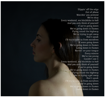

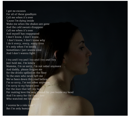
For the inside of the CD, I also went for a more simple but significant structure. As I mentioned in the front and back cover she is wearing clothes, while in the inside, she is naked meaning that she is vulnerable and sincere with herself. I took these photos in the same location as in the front and back cover but I just changed the position of the lights in order to make the background less black and for the light to illuminate the centre of the photo. For the design, I chose the same photo and changed the orientation so both looked at the CD. After doing research, I found out that most digipaks contain lyrics in this part of the CD and that it was I did. I picked the lyrics from the song I chose for my music video (Sober) and looked for another song which had the same name as the CD cover and one of the songs in the CD, Down in flames. I placed the lyrics right on the lateral of the photo and by this make it look like the lyrics are coming right out of her as if she is "telling the truth"
Outside of the flap:
For the outside of the flap, I just picked one photo of the same photo shoot as the inside of the CD so it matched the the theme. This time she had a different pose so the light illuminated part of her face more than another, making the same contrast as the front and back cover with the inside of the CD. I decided to use the split lighting technique to show one part of her face illuminated. This part being illuminated means that she looks okay on the outside and the other side of her face being darker symbolises the darker side of her and her inner turmoil. Once again she appears naked in the inside to once again show how she is vulnerable and sincere with herself and with clothes in the outside symbolising she is strong while she is not.


Comentarios